The Cincinnati Recycling & Reuse Hub is a nonprofit organization that recycles hard-to-recycle materials and collects items in its free reuse section. As an avid user of the Hub, I knew the nonprofit’s visual identity needed a refresh, especially if it wanted to attract new users and donors.
CONTEXT
CHALLENGE
Perform a brand analysis and create a new visual identity that retains current hub users and attracts new users and corporate donors.
The Cincinnati Recycling & Reuse Hub’s visual identity needs a refresh, especially if it wants to attract new users and donors.


ANALYZE
Public-Facing Visuals
After looking at all of their public-facing visuals (i.e. social media, website, logo, etc.), I listed the top areas of improvement opportunities for the Cincinnati Recycling & Reuse Hub’s visual identity. Though I started the new design system from scratch, this analysis shows where their public appearance started.
Top of the recycling can is referencing the Great American Building.
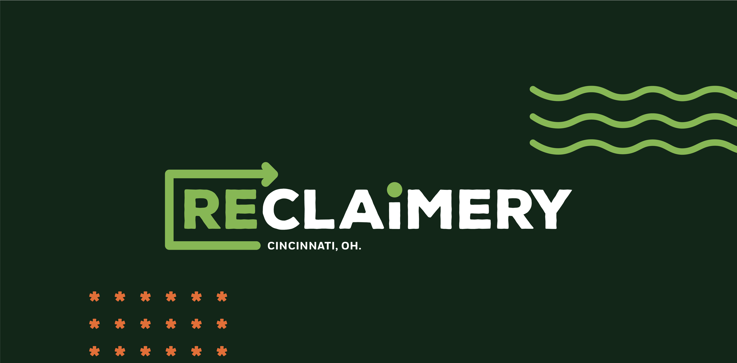
Difficult to understand & “Cincinnati” doesn’t need to be referenced in the logo & name.
Strong visual tie to recycling, but not to reuse.
Name = too long & lacks the vibrant, creative culture of the Hub. & doesn’t align to logo.
Logo Variations are needed for dark backgrounds, social media profile photos, etc. (Example in Annual Report)
LOGO LOCKUP & USAGE


Social Media Banners don’t match brand standards & only leans into the recycling aspect.
The full brand name isn’t the Instagram name, CintiRRH is, which makes it challenging to search. “CintiRRH” is only on socials, nowhere else.
In interviews, numerous hub-goers didn’t know the Hub was on social media because they couldn’t find the account.
Posts lack consistent visual language, when users see the post on their feed, they don’t immediately associate it with the Hub brand.
SOCIAL MEDIA
Circular elements (photo frame, page #s, lines endpoints) are only found in this report.
Icons range in style, which looks disconnected.
New colors are introduced in this report, nowhere else in branding.
Logo Variation is needed for the cover.
Craft issues like overly tight margins, inconsistent type sizes, competing hierarchy, etc.
ANNUAL REPORT
ANALYZE
SWOT Diagram
High Community Engagement - for those aware of this resource
One of a kind - only expansive recycling & reuse hub in the Midwest
Large, Measured Diversion of Waste - 400+ tons diverted from the landfill
Electronic Item Recycling = Revenue stream
Expansion to collaborating with businesses = Revenue Stream / Large diversion of waste
STRENGTHS
Low brand awareness beyond “plugged-in” community
Low Corporate Sponsorship
Social Media / Digital Presentation = inconsistent in timing/branding
Inconsistency in branding & graphics
Deeper Volunteer Involvement - Committees need more members outside of the board/directors
WEAKNESSES
Collaboration with community organizations to secure funding & increase resource awareness
Expand to a compost drop-off location
Expand brand assets - to aid with addressing other pain points
Improved engagement with first-time users - Using website & social media to lessen barrier of entry with newcomers
Community champions - volunteers who set up waste diversion spots in neighborhoods & transport it to the hub (inspired by community-led energy initiatives).
OPPORTUNITIES
Funding
Spatial Restrictions - limited space for expansion in shared-building
Limited employee & volunteer capacity
Societal relationship/attitudes with trash/recycling/reuse
Users disposing of curbside items at the hub & costing them $$
THREATS

BRAND GUIDELINES
I aimed to keep the deliverables simple yet visually appealing. The elements are bold, bright, and energetic to encapsulate the energy that radiates from The Reclaimery.


